Data Processing and Visualisation
For a warm-up
Good visualization is clear thinking made visible
– Edward Tufte
Introduction
One of the more interesting cases of data visualization concerns time series. Time series are a special case of stochastic process, but we won’t delve too deeply into that - it’s easy to get lost. However, studies at the mathematical department oblige us, and a bit of formality is a must.
In the mathematical context, a time series \(Y\) with randomness can be expressed as \[ Y(t) = f(t,\varepsilon_t), \]
where:
\(Y(t)\) is the value of the time series at time \(t\);
\(f\) is a function describing the dependency over time, which can include various aspects, such as trend or seasonality;
\(\varepsilon\_t\) is the random component representing unpredictable changes at time \(t\).
In our further considerations, we will assume that time is discrete. It’s a natural assumption, not least because we are not able to observe something continuously. Thus, it will suffice to understand by a time series the following sequence of random variables \[ Y(t_1), Y(t_2), \ldots, Y(t_n). \]
It is important to understand that randomness in time series does not mean lack of structure or patterns. On the contrary, time series analysis often involves identifying hidden patterns and structures in the data, while taking into account their unpredictable and random aspects.
A time series does not have to be strictly random in the sense that each observation is completely unpredictable, but in practice, most time series that statisticians and analysts deal with contain an element of randomness or unpredictability. Randomness in time series can arise from various sources, such as:
Noise: Fluctuations in the data that are not predictable based on available knowledge or models. Noise can come from many unknown, negligible, or complex factors affecting the data-generating process.
External variables: The impact of external variables that are not directly modeled in the analyzed time series can introduce an element of randomness. These could be changes in the economic, political, or natural environment, for example.
Internal system dynamics: In some systems, internal dynamics can lead to behaviors that are difficult to predict in the long run, even if they are described by deterministic equations.
Examples
We are surrounded by time series, and we ourselves are part of them. Here are examples:
EKG: A time series of the heart’s electrical activity over time. Based on analyses, for example, a heart defect can be detected.
Meteorological data: A time series of air temperature measured daily at the same hour throughout the year. These data can be used for analyzing climate changes, seasonal temperature fluctuations, or for weather forecasting.
Stock market data: A time series of daily stock index closings, such as WIG20 or S&P 500. By analyzing these data, investors can identify market trends, forecast future stock price movements, and make investment decisions.
Sales data: A time series of a product or service’s monthly sales by a company. These data help companies in analyzing sales seasonality, assessing the impact of marketing actions on sales, and planning production.
Observations
Let’s assume we have time series observations in the form \[ (t_1, y_1), (t_2, y_2), \ldots, (t_n, y_n). \]
Very often, observations are made or recorded at equal time intervals, i.e., \[\Delta t \equiv const.\]
Then, it suffices to know at what moment the first value was observed, at what time intervals the subsequent ones, and operate with values \[y_1, y_2, \ldots, y_n.\]
Correlation chart
If we observe a specific characteristic over time, a natural question arises: does it depend on time? And if so, how?
Look for clues in the correlation chart.
A correlation chart, also known as a scatter plot, is a graphical representation of the relationship between two variables. It allows for the visualization and assessment of the degree to which the variables are related.
Example
For example, let’s generate observations related to a time series based on a linear trend ourselves.
import locale
import matplotlib.pyplot as plt
import pandas as pd
import numpy as np
import matplotlib.dates as mdates

# Data generation
rng = pd.date_range(start='2020-01-01', periods=100, freq='D')
trend = np.linspace(0, 10, len(rng))
ts_with_trend = pd.Series(np.random.randn(len(rng)) + trend, index=rng)
As an exercise: Based on the code, characterize the generated time series.
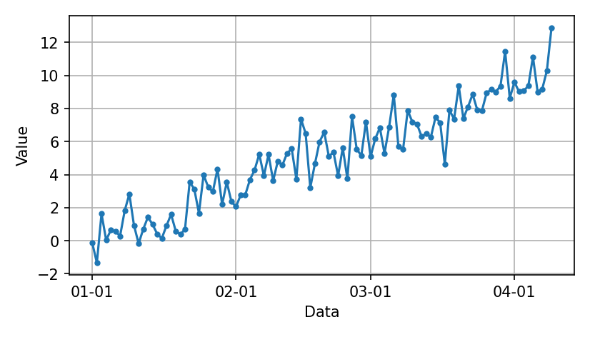
To start with, such a chart.
# Creating a chart
plt.figure(figsize=(14/2.54, 8/2.54))
plt.plot(ts_with_trend.index, ts_with_trend.values)

# Formatting the X-axis
plt.gca().xaxis.set_major_formatter(mdates.DateFormatter('%m-%d'))
plt.gca().xaxis.set_major_locator(mdates.MonthLocator())

plt.xlabel('Data')
plt.ylabel('Value')
plt.grid(True)

# Automatic layout adjustment
plt.tight_layout()

plt.show()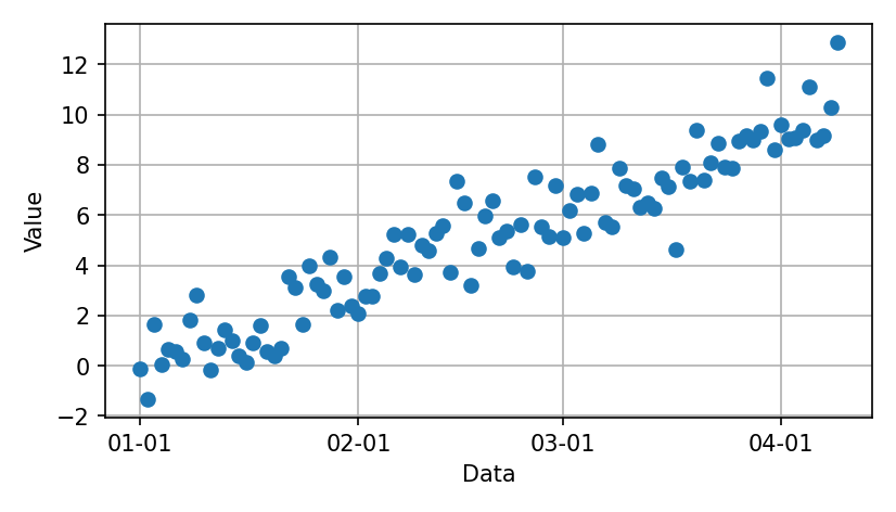
A dense scatter plot sometimes highlights trends based on a functional relationship, as in this case. But it’s hard to discern the order of successive changes.
One solution is to connect consecutive points.
# Creating a chart
plt.figure(figsize=(14/2.54, 8/2.54))
plt.plot(ts_with_trend.index, ts_with_trend.values)

# Formatting the X-axis
plt.gca().xaxis.set_major_formatter(mdates.DateFormatter('%m-%d'))
plt.gca().xaxis.set_major_locator(mdates.MonthLocator())

plt.xlabel('Data')
plt.ylabel('Value')
plt.grid(True)

# Automatic layout adjustment
plt.tight_layout()

plt.show()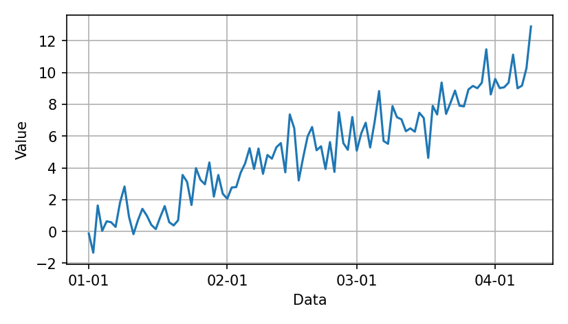
And often these two styles are combined.